
2023 - 2024
Student project
See more
Project type
Individual
My role
Graphic design

Overview
Background
The Ho Chi Minh City Museum of Fine Arts (HMFA) is one of Vietnam’s most iconic art institutions — a place where history, architecture, and creative heritage converge. However, despite its cultural significance, the museum’s visual identity had not evolved with time, resulting in a fragmented and outdated brand presence.
This rebranding project was developed as part of an academic design course at Hongik University, South Korea, focusing on creating a new, cohesive brand identity system for HMFA. The goal was to modernize the museum’s image while preserving its distinctive architectural and cultural roots.

Problem statement
The original HMFA visual identity lacked consistency and contemporary appeal. Typography and visual elements did not reflect the museum’s unique fusion of French-Indochinese architecture and Vietnamese artistic heritage.
Key challenges included:
Outdated logo and type system inconsistent across media
Lack of visual connection between the museum’s architecture and its branding
Limited adaptability for digital and environmental applications
The rebranding aimed to address these challenges by crafting a design system that embodies both heritage and modernity — positioning HMFA as a timeless yet forward-looking cultural landmark.

Our Process for HMFA
We adopted a research-driven and typographically focused approach, analyzing the museum’s visual language, spatial context, and architectural rhythm. The process emphasized cultural symbolism, typographic experimentation, and design system scalability across print and digital formats.
Key Actions Taken
1. Cultural & Visual Research:
Studied the historical context of the museum and the architectural geometry of its French-Indochinese structure. This informed the development of visual motifs and grid systems rooted in proportion and symmetry.
2. Typography Development:
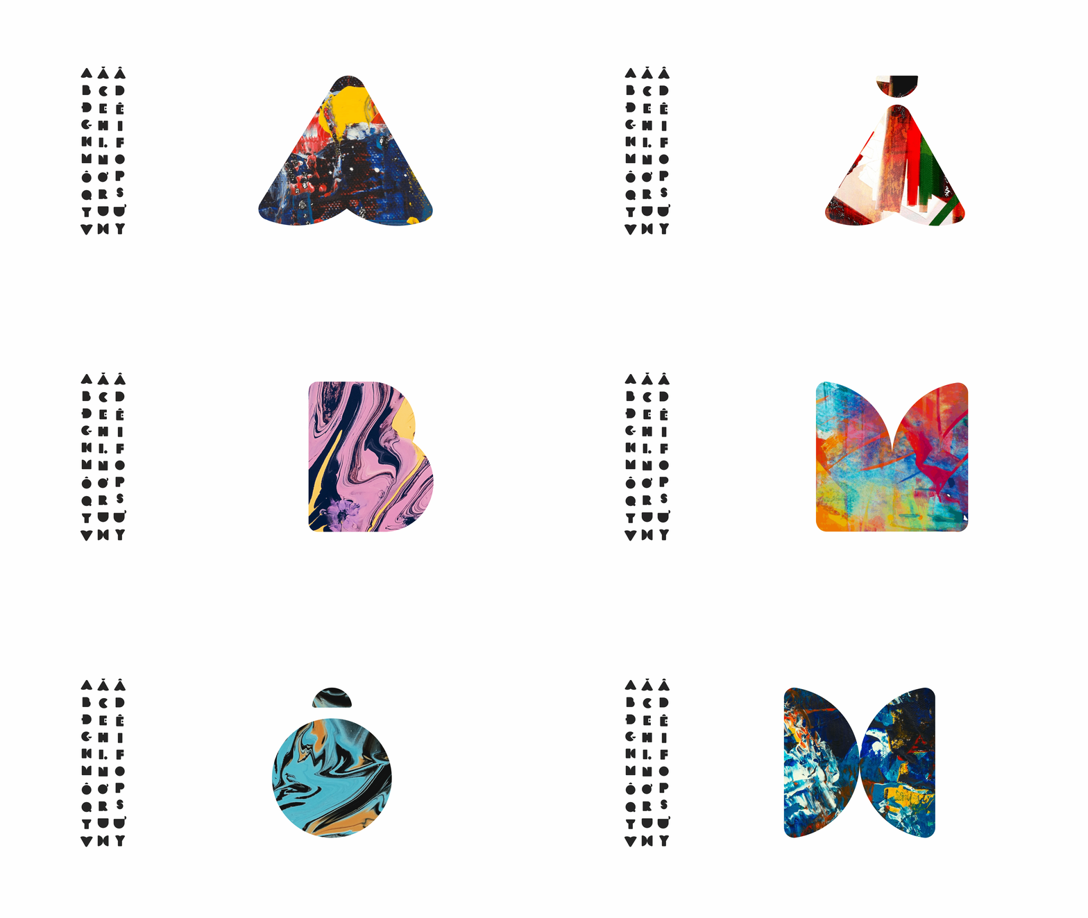
Designed a custom typeface system inspired by the museum’s structural details — arch forms, column patterns, and window motifs — translating architectural features into typographic character.
3. Logo Redesign:
Redesigned the HMFA logo with a refined typographic mark that balances elegance and solidity, symbolizing both the artistic fluidity and architectural stability of the institution.
4. Visual System & Applications:
Developed a modular identity system adaptable across posters, wayfinding, tickets, merchandise, and digital platforms. Each touchpoint communicates the museum’s renewed voice — contemporary, educational, and culturally grounded.
Key Features Introduced
Custom HMFA Display Typeface based on architectural motifs
Simplified logo and grid system for consistent application
Cohesive color palette reflecting heritage and art materials
Flexible layout and print system for exhibitions and publications
Scalable digital-ready design system

Results and Impact
The project received a perfect grade of 4.5/4.5 at Hongik University, recognizing its conceptual depth and execution quality. It was also awarded the Idea Award at the International Busan Design Award 2024, honoring its cultural reinterpretation and typographic innovation.
Beyond academic recognition, the rebrand reimagined HMFA as more than a museum — it became a living symbol of Vietnam’s artistic continuity, bridging traditional aesthetics with modern design sensibilities.
